

With more than half of the world’s Internet traffic originates from mobile devices, mobile UX can be rightly called the driver a third screen revolution. In fact, the average user has at least two to three frequently used mobile devices. That makes mobile UX design a matter of existence for developers.
UX designing for mobiles is quite like shooting in the dark. Until the mobile website or app goes out in the world and users start using, you don’t know for certain how successful it is going to be. Sometimes what we assume to be the best way to do something could actually be the opposite of what customers are expecting.
Luckily, we have design experts to look up to and get inspired to design the best mobile UX. they show the world which are the best practices to create a stunning mobile UX. This blog is a collection of such mobile UX best practices.
Create user personas
In UX designing, user persona is a fictional creation of who your ideal user is. The persona is drawn based on market research and known traits of the target audience. The user persona would also include facts like the goals, motivators and expectations of users. Creating the right user persona can help craft a relevant mobile UX that will hit its target.
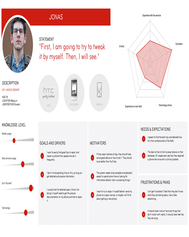
This is how a typical user persona would look like for a user of mobile repair services:
Here are some tips that will help you create the right user personas.
- Summarize observations from research
- Determine what users are being served now and what they expect to be served in the future
- Don’t dwell too much on the research.be flexible for deviations from research findings
- Use scenarios and process flows to determine how each user persona should be treated
Make features intuitive
This is a no-brainer in UX designing. Still, we often make the mistake of assuming that users will find their way around the app. Well, one prime reason why users uninstall apps is because they are difficult to use. Don’t make that mistake.
Instead, make it a point to make feature intuitive enough for users. The menu, buttons, the filters – everything should come to them naturally in the due course of using the app. The more easy it is for them to use the app, the more time they will spend on the app.
In other words, stick to habit loops that your users have got used to. If there is a specific gesture or action that users have got used to in the app, stick to the same. Don’t try to train them with a new setting or gesture. Users are more oriented toward consistent and habitual experiences.
Design tap-friendly buttons
One reason why mobile apps are more popular than web applications is that of their ease of navigation. With few taps, swipes and pinches of fingertips, users can make applications work to their commands. That makes mobile app buttons an integral part of mobile UX designing. For example, placing the buttons near to the bottom where it can be easily reached for tapping is one of the best practices.
Tap-friendly buttons can make a sea of a difference to the user experience. Here are some ways to create tap-friendly buttons:
- Design buttons like buttons with proper CTAs
- Use whitespace in buttons if the background is of the same color
- Use easily recognizable button styles and shapes
- Use color psychology to highlight the purpose of each button
- Give ample sizing of buttons to make them finger-friendly
- Use only essential number of buttons
Use readable fonts
The design is not just about shapes and colors. Fonts and typography also have a huge role to play in the UX. the right font in the right place can imbibe a feeling that is relevant and relatable to the page or app.
Fonts also have the responsibility of making information easily readable and comprehensible. Here are some most commonly used UI font styles that help with that:
- Open Sans
- Montserrat
- Playfair Display
- Roboto
- Proxima Nova
The good news is you can find most of these fonts from the Google Fonts repository.
Legible placement of other elements
A mobile app or a responsive website is an amalgamation of several design elements. Some elements could be visually created for design aesthetics while others may have to be displayed for specific purposes.
For instance, the trust seal comes with EV SSL certificates, or the business association with local business chambers, list of accepted debit and credit cards so on and so forth. Planning enough breathing space for each of these elements while designing the interface can deliver a better mobile UX.
Consider outdoor usage
In dark settings or outdoor light settings, the mobile UX can be entirely different. Interfaces in light backgrounds have limited visibility in bright light settings. Also thin and minute detailing may also be missed in different light settings.
Ensure that the interface and UX is inclusive for all light settings, including outdoor usage. If users find it difficult to use the app in outdoor conditions, they might stop using the app completely.
In Summation
With mobile devices overtaking other devices usage, designing a near-perfect mobile UX is the need of the hour. There is no readymade manual available to master mobile UX. what UX designers can do is to follow certain best practices that will elevate their skills and also the user experience of the apps that they create to a whole new level.