
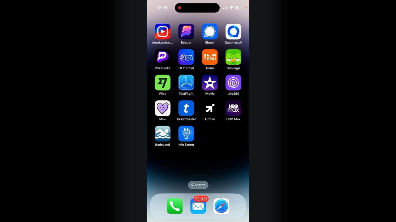
If you’ve recently noticed that your beloved Duolingo app icon looks a bit tired, sad, and old, you’re not alone. Many Duolingo users have taken to social media to express their confusion and concern over the app’s new wrinkly, depressed-looking owl mascot. But don’t worry – there’s a method behind this seemingly strange design madness.
It’s a Deliberate Design Choice
First and foremost, the tired and sad appearance of the Duolingo icon is not a glitch or bug. It’s actually a purposeful design decision by the Duolingo team. They periodically release temporary themed icon variations, like the recent melting owl icon, as a way to engage users and create buzz.
The psychology behind this tactic is rooted in a concept called the “novelty effect.” Introducing a new stimulus, even a small one like an app icon change, can temporarily boost engagement and motivation. It piques users’ curiosity and prompts them to open the app to see if there are any other new updates or content.
Encouraging User Engagement
Duolingo is known for its gamified approach to language learning. The app uses various strategies like rewards, leaderboards, and streak counts to keep learners motivated. The periodic icon changes are another gamification element, almost like an “Easter egg” for users to discover.
The tired owl icon serves as a subtle reminder to users to open the app and complete their daily language lessons. Duolingo’s success relies on users consistently engaging with the app, so any tactic to boost app opens and session time is valuable.
Additionally, the unique icon helps Duolingo stand out visually among the many other apps on a user’s device. In a crowded app market, that brand differentiation is key.
Sparking Social Media Chatter
Another benefit of the quirky icon update is that it gets people talking about Duolingo organically on social media. Confused or amused users post about the icon change, which raises awareness of the app and can even attract new users who are curious about the commotion.
This social media chatter is valuable free marketing for Duolingo. It’s a clever way to stay top-of-mind with current users while also expanding their reach to potential new learners.
The Importance of App Icon Design
While it may seem like a minor detail, an app’s icon is a crucial part of its branding and user experience. It’s often the first interaction a potential user has with an app while browsing the App Store. An eye-catching, memorable icon can make the difference between a download or being overlooked entirely.
For existing users, the app icon serves as a constant brand touchpoint. It’s seen every time they use their device, even if they don’t open the app itself. So even a small change, like Duolingo’s tired owl, can have a big impact on how users perceive and engage with the brand.
Will the Tired Owl Stick Around?
The Duolingo team has assured users that, like past icon variations, the tired owl is only temporary. It will eventually revert back to the standard bright-eyed, bushy-tailed owl we all know and love.
However, some Duolingo users have grown quite fond of the new melancholic mascot. Duolingo Plus subscribers and Streak Society members actually have the option to keep the tired owl icon, or choose from a few other fun alternatives.
Final Thoughts
Now the mystery of the tired Duolingo owl is solved. While it may seem like an odd choice at first glance, the iconic change is actually a strategic move to boost engagement, differentiation, and brand awareness.
Love it or hate it, you have to give Duolingo props for their creative approach to app design and marketing. They consistently find new ways to make language learning feel fresh and keep their users on their toes. And who knows – maybe we’ll all grow to love our weary little green friend.
The next time you spot a strange app icon on your homescreen, take a moment to appreciate the thought and strategy that went into that design decision.